The Evolution of a Book Cover
May 24th, 2011 | Books, Gay, Hell's Pawn
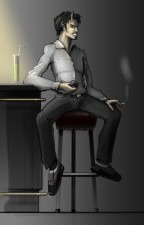
My third novel, Hell’s Pawn, is nearing release. Rather than just reveal the cover art like I usually do, I thought it would be fun to show you all the stages we went through to get to the final product. Hell’s Pawn is a story that takes place completely in the afterlife. Not just Heaven and Hell, but the realms of many major religions, past and present. Most of the characters are contemporary, souls that lived in our time, but there’s one character that’s different. Rimmon is an incubus, a handsome male demon and sort of the love interest of the main character. Some time ago, Andreas was doing character sketches for fun and asked me for an idea. I slyly described Rimmon, and Andreas came up with the drawing below.
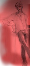
As fun as it was to see one of my characters come to life on the page, Andreas didn’t draw this with a cover in mind, but this piece did end up influencing the direction we took. I liked the idea of Rimmon being on the cover, since he’s not only sexy, but intriguing. I don’t like to pin Andreas down creatively, so I described Rimmon vaguely, mostly only stressing his attractiveness. The first result is below.
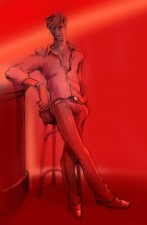
Yeah, that’s hot, but it’s also a lot younger than I expected. Naughty Andreas! I asked him to age Rimmon up, since his character is both mature and intelligent, which isn’t quite conveyed by such a youthful appearance. A little bit of magic, and Andreas had finally done it. We had found Rimmon.
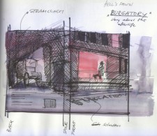
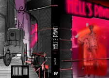
Now that we had our centerpiece, it was time to set him on stage. In the novel, Hell isn’t depicted as fire and brimstone. Instead Hell is based on a modern European city, so the bar scene could still work. Andreas came up with this rough concept, which we were both very excited about.
The front cover would be an outside view of the bar, with Rimmon visible in the window. The back cover would wrap around to an alley, where an old Gurney steam coach is parked. Er… It makes sense if you read the story, I swear. The best part is that the book’s title could be the bar sign, an idea that I still love.
Unfortunately, this new mockup began to worry us both. If Rimmon was behind a window and realistically placed further in the interior, he wouldn’t be nearly as visible to the viewer. Besides, who stands in a bar facing the window? Andreas suggested we keep the concept but turn the entire thing inside out.
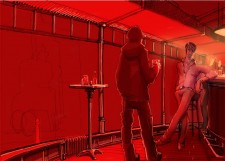
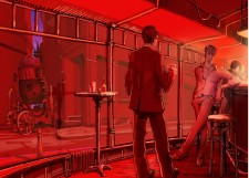
I’m pretty sure I jumped up and down in excitement at this point. Not only could we see Rimmon better, but there was now room for another character. Rimmon had someone to seduce, rather than staring forlornly out the window. In this case, I decided it should be John Grey, the novel’s protagonist. John has a rough time adjusting to the afterlife, but things get a lot more interesting for him when he meets Rimmon. John’s a sharp dressed man though, so the figure in front needed to change.
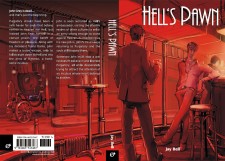
Obviously Andreas really ran with the concept at this point, turning his full attention to the background and fine detailing. Now, with a full blown piece of art, all that was left was formatting into a book cover. This means setting the title, placing the back blurb, working in the bar code and tons of other things. The end result can be seen below:
I couldn’t be happier. Andreas really outdid himself this time. Is it any wonder I’m head over heels in love with him? A proof copy of the book is winging its way to Germany right now so we can see it in the flesh. Once we do, there might be some other small changes, but we’re more or less there. Once my early readers give me the green light, Hell’s Pawn will be ready for release, hopefully by mid summer. No matter what the critics make of the insides, thanks to Andreas, I can’t imagine anyone complaining about the packaging.
If you want to see more of Andreas’s art, stop by his website or his blog.

